All vendors who produce materials of any nature for Unifor and/or Unifor local unions must comply with the identity guidelines set out by the union's constitution.
Contact @email for permission to use Unifor's logo or if you have any questions.
The information provided below is only a summary of the full guidelines. Please download the identity guidelines (pdf).
Trademark Licensing Agreement
All vendors who produce materials of any nature for Unifor and/or Unifor local unions must comply with the identity guidelines set out by the union, as contained in this document.
Below is an excerpt of the licensing agreement.
“Unifor expressly reserves and retains the right to control the nature and quality of all products on which Licensee may use the trademarks, as well as the process by which such products are produced, manufactured, sold and distributed. Upon Licensor’s request, Licensee shall promptly furnish to Licensor samples of the various products and labeling on which it makes such use. Licensee also grants Licensor the right at any reasonable time to enter and inspect the premises on which the products are produced, manufactured, stored, distributed or sold... This license is revocable at any time by Unifor for any reason. The license shall be deemed automatically and immediately suspended should Licensee become the subject of a strike by its unionized work force. The right of Licensee to use Licensor’s trademarks is not assignable.”
Contact @email for the licensing agreement. All vendors producing materials for Unifor and/ or Unifor local unions must sign and abide by the licensing agreement. Violation of the licensing agreement, trademark and identity guidelines will cause the contract and license of use to be revoked.
Layout options
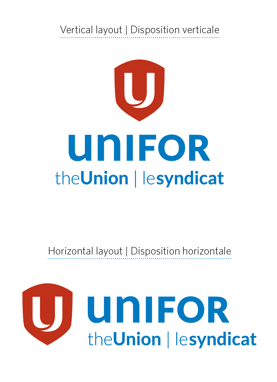
Vertical and horizontal layouts In order to maximize usability across various print and digital media, each identity (with the exception of the shield icon) has a vertical and horizontal layout. The identity can be used in either of these layout options.
Note: There are no other layout options to horizontal and vertical as pictured. Re-arranging the wordmark with the shield is not permitted, although the shield can stand alone without the wordmark but not vice-versa. See Unacceptable Usage.
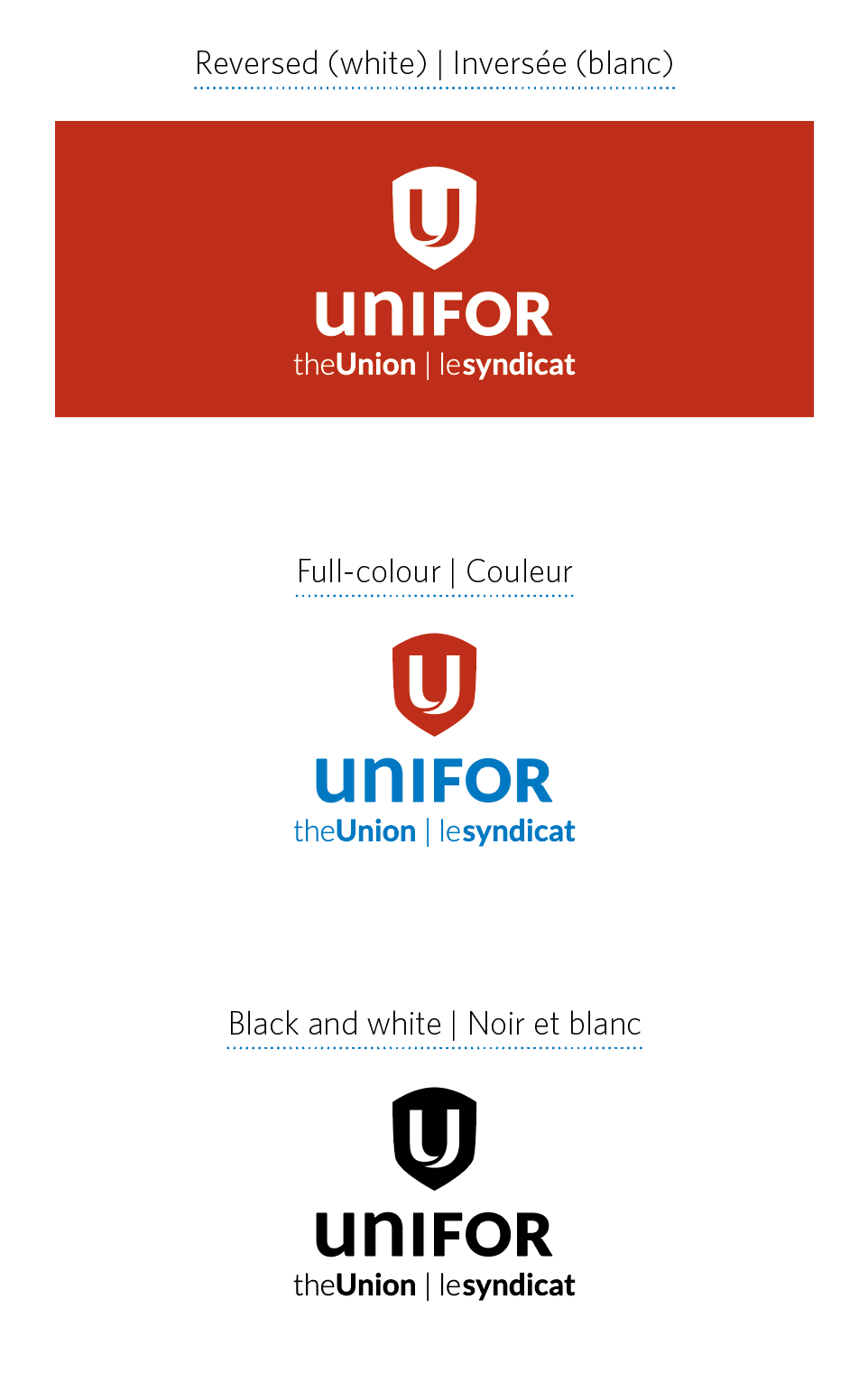
Colour variations
Visibility and legibility of the Unifor identity is key. In order to maximize visibility, each identity can be reproduced in full-colour, reversed (white) or in all black.
It is recommended that the full-colour identity or reversed identity on red be used whenever possible.
The reversed identity can also be used on background images provided the visibility of the identity is not hindered in any way.
Acceptable Usage
Standards around identity usage have been developed to ensure the integrity of the Unifor identity through all forms of applications and media.
The Unifor usage standards in this section will provide you with information on visibility, legibility, clear space and minimum size requirements and how to ensure these standards must being followed when using the Unifor identity in applications.
The identity can be used on a white, coloured, textured or photographic background. When using a textured or photographic background, the identity should always be clearly visible and never compromised by the imagery.
Always use the identity files supplied by Unifor. Never attempt to recreate any part of the logo.
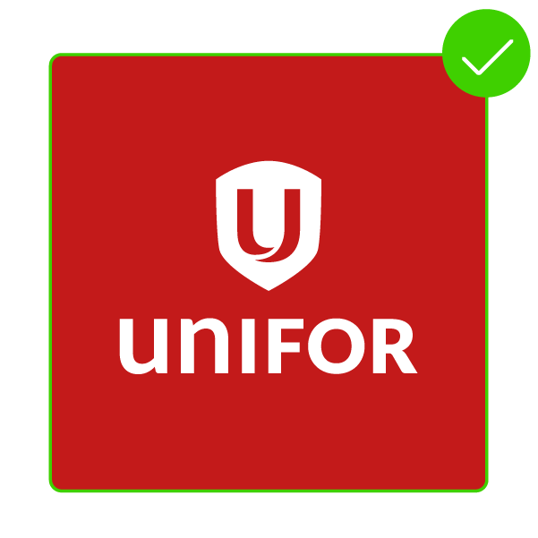
Preferred use. The reversed (white) version of the identity can be used on a red background without distorting or altering the identity.
The identity can be used in colour or black on a white background without distorting or altering the identity. Note: in the full colour logo, the "U" in the shield should always be white.
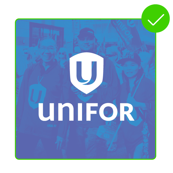
The reversed (white) version of the identity can be used on a photographic background as long as legibility is not compromised.
Unacceptable Usage
The identity should never be placed on a coloured, textured or photographic background that compromises its visibility or legibility. The composition, type, icon or colour of the identity should never be altered in any way. Under no circumstances should the identity be skewed, squished or distorted.
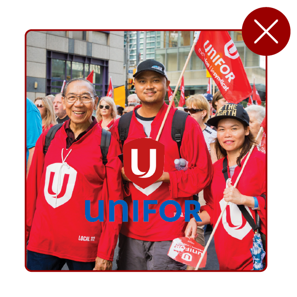
Never use the full-colour identity on an image background.
Never distort the identity.
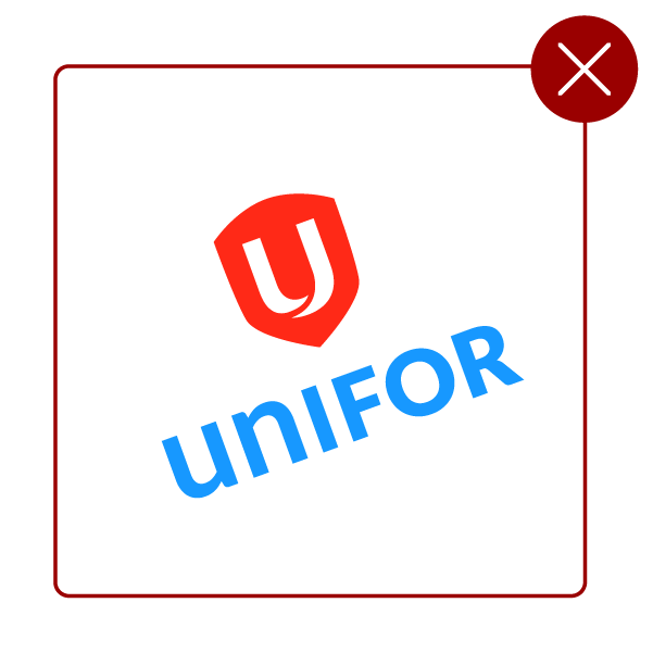
Never tilt or alter the colour of the identity.
Never replace or recreate the identity typefaces.
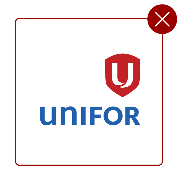
Never alter the alignment of words or icons in the identity.
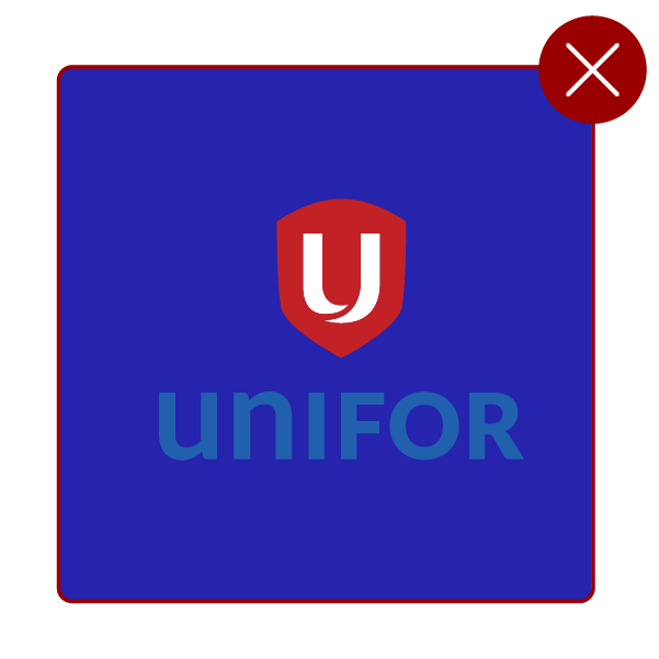
Never use a background that compromises legibility.
Never fill the Unifor "U" with a colour other than white.
Never allow part of the Unifor identity to be cut off.
Never use only the wordmark element of the identity. The wordmark is meant to be used in combination with the shield, either vertically or horizontally as outlined in Layout Options.
Never alter the alignment of words or icons in the identity.
Elements of the logo cannot be manipulated separately.
Visibility Standards
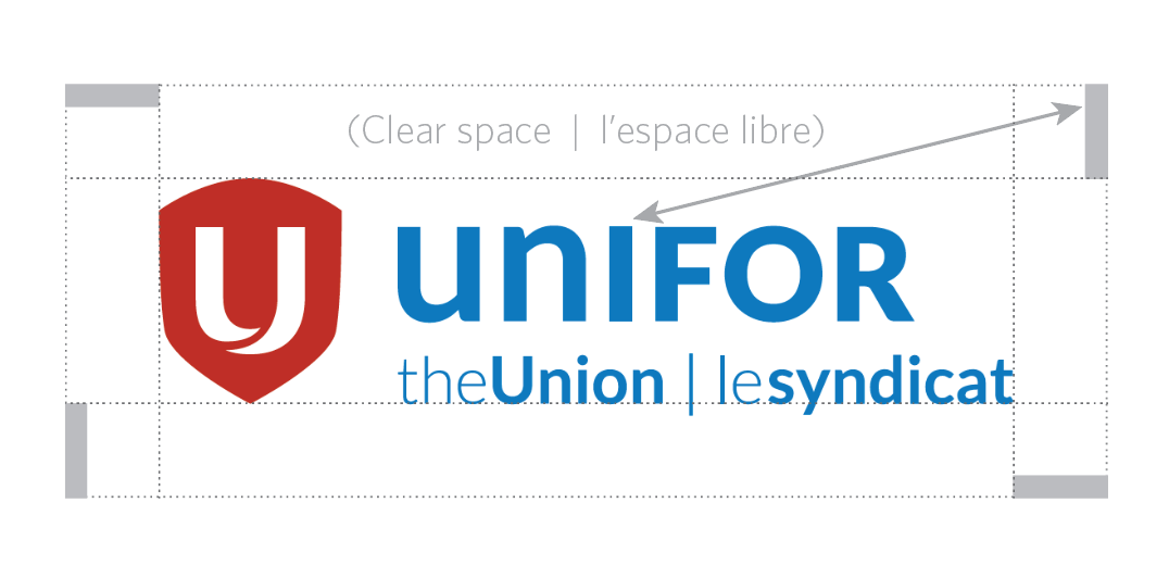
Clear space is the safe area around the identity where no text, graphic or photographic elements can appear. In the example provided, the clear space surrounding the identity is designated by the outermost dotted line.
Each identity file provided includes the necessary clear space within the image. Follow the identity’s clear space guidelines to prevent compromising the visibility of the Unifor identity.
Colour and Typography
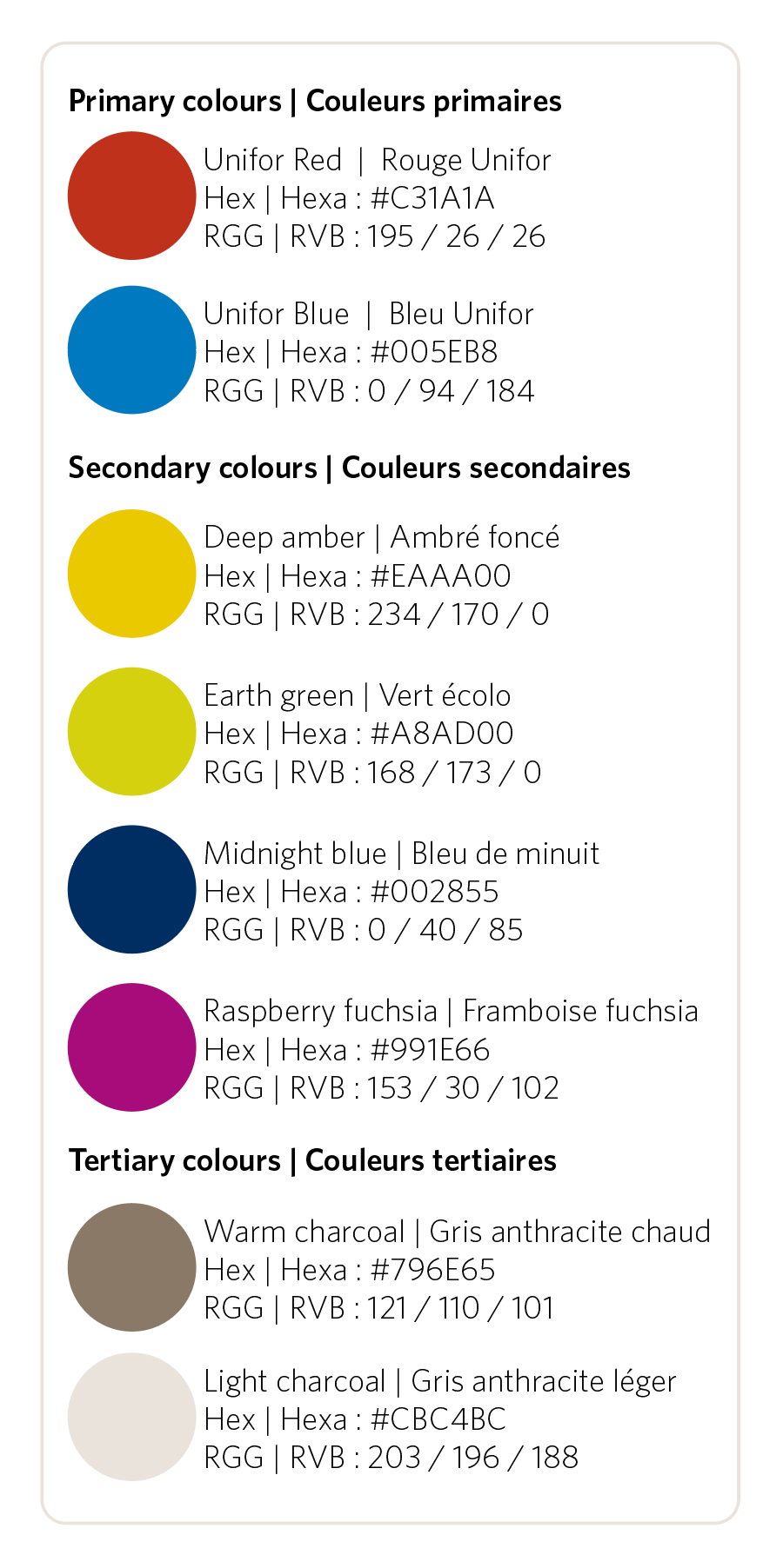
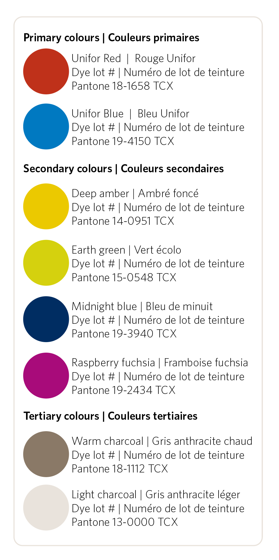
Colour is an important tool that helps to differentiate our identity and helps to give our communication materials a unique and recognizable style. Proper colour usage plays a critical role in ensuring that Unifor conveys a consistent presentation throughout all communication materials and properly presents the identity.
Good typography allow the viewer to read without distraction. Consistent use of type is an essential element to building and maintaining brand awareness. By controlling the type styles used, Unifor is able to maintain a consistent brand image and promote legibility, thereby strengthening the identity.
Digital Screen Colours
The overall look of the materials created should reflect these as the main colours. Secondary colours and tertiary colours may be used as accents or supporting colours, such as in graphs or as highlights, but no one colour should be used in greater quantity than the primary colours.
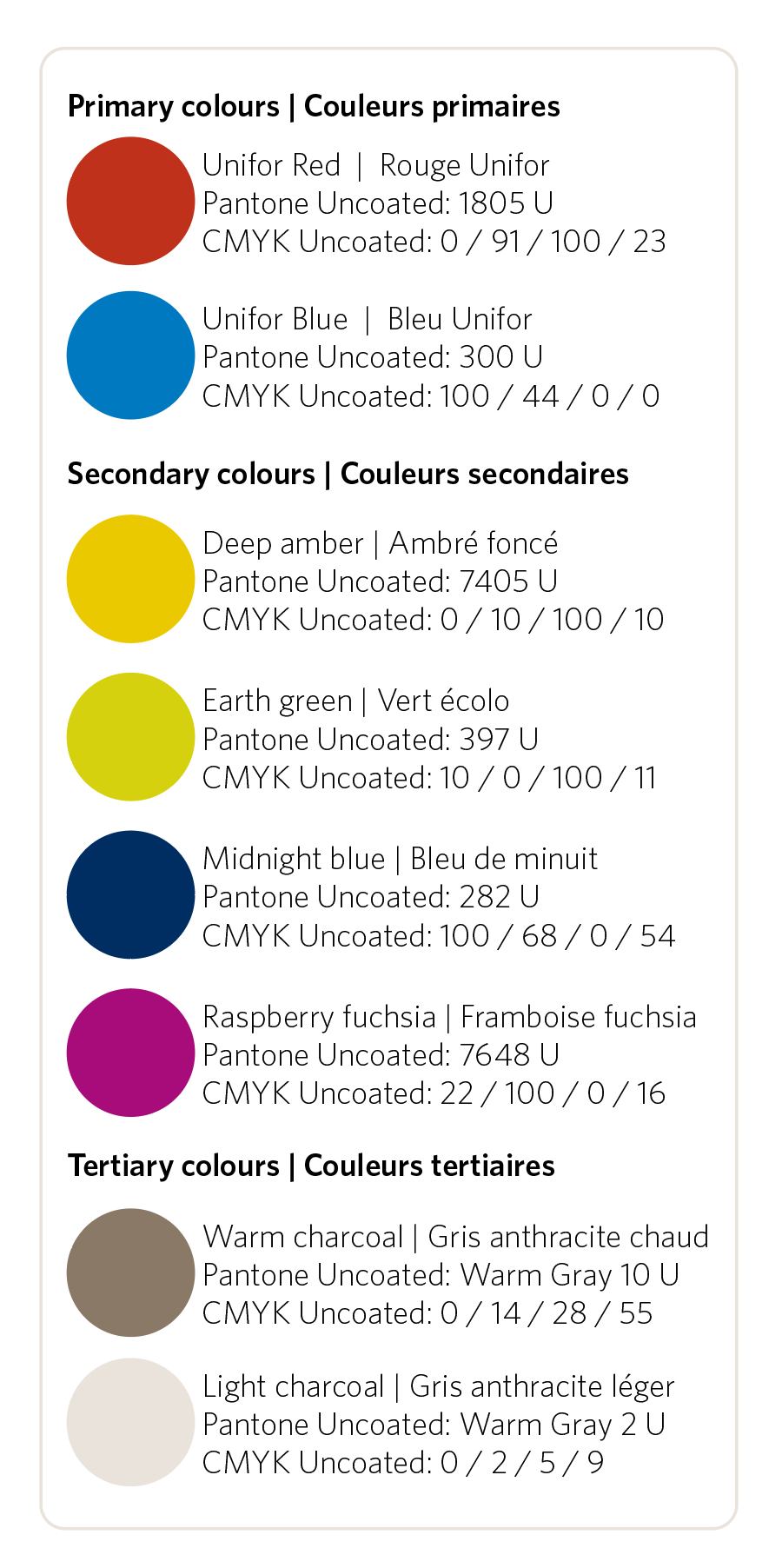
Print colours
See the full guide for descriptions of various printing methods and materials (eg. coated vs uncoated).
Textile Colours
Typefaces
Primary Typeface: Lato
Lato makes up the identity, descriptors, regions, locals, and taglines.